Contact Details
sales@thrasker.com (813) 565-9024 10901 Danka Circle North, Suite BSt.Petersburg FL 33704
The design of the "Taslom" presentation slides demonstrates a
harmonious blend of design principles that are key to conveying
the brand's message effectively and aesthetically. As we unpack
the visual elements, typography, color scheme, imagery, and
layout, it becomes evident how these components work
synergistically to create a compelling narrative for the affiliate
program that Taslom is presenting.
Each slide exhibits a strong visual hierarchy, directing the
viewer's attention to the most critical information first. The
designers have adeptly used scale, color contrast, and typographic
weight to differentiate between primary headings, secondary
information, and tertiary details. The most significant textual
elements are prominent, often set in a bold, sans-serif typeface,
while the supportive details are given in a lighter or smaller
font. This hierarchy not only guides the viewer through the
content but also underscores the importance of different sections,
making the slides both easy to navigate and engaging.
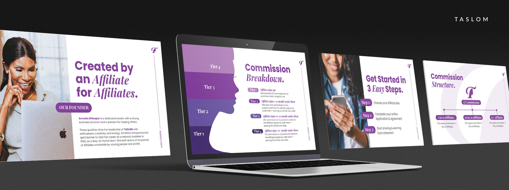
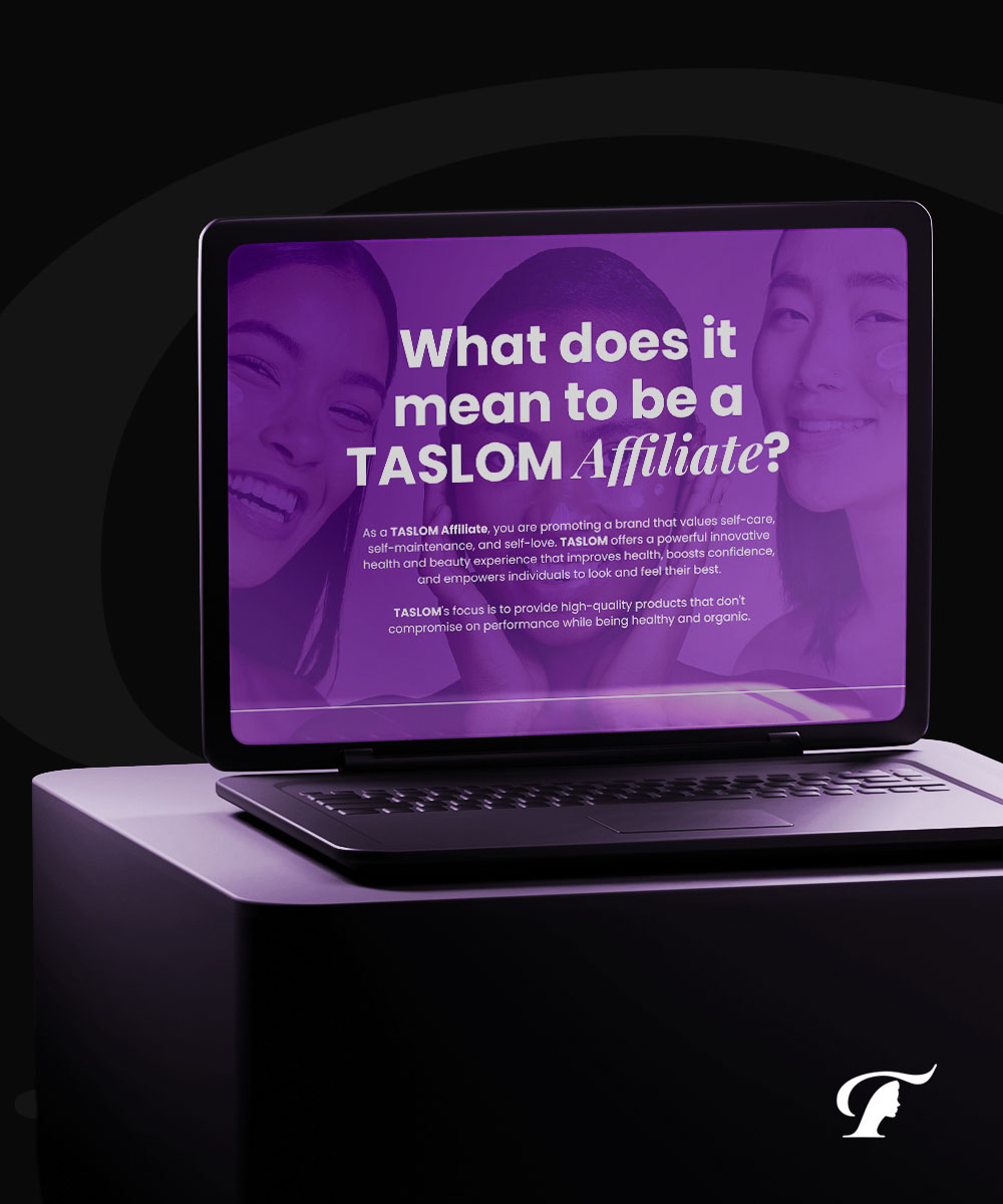
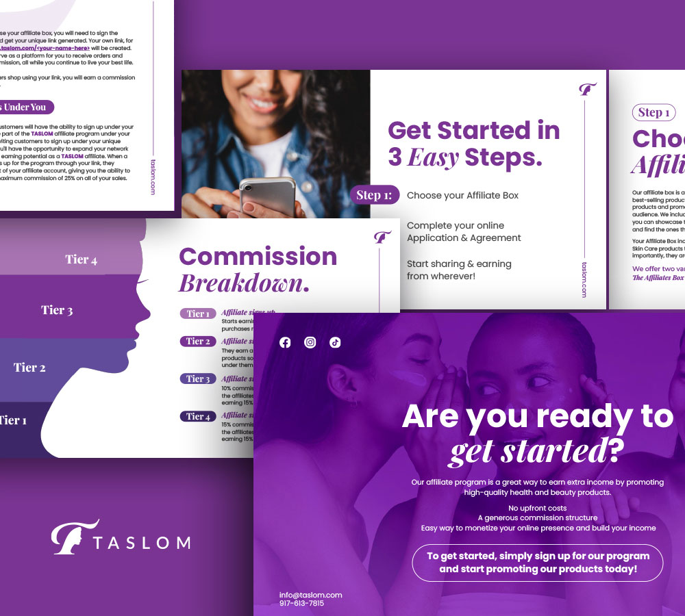
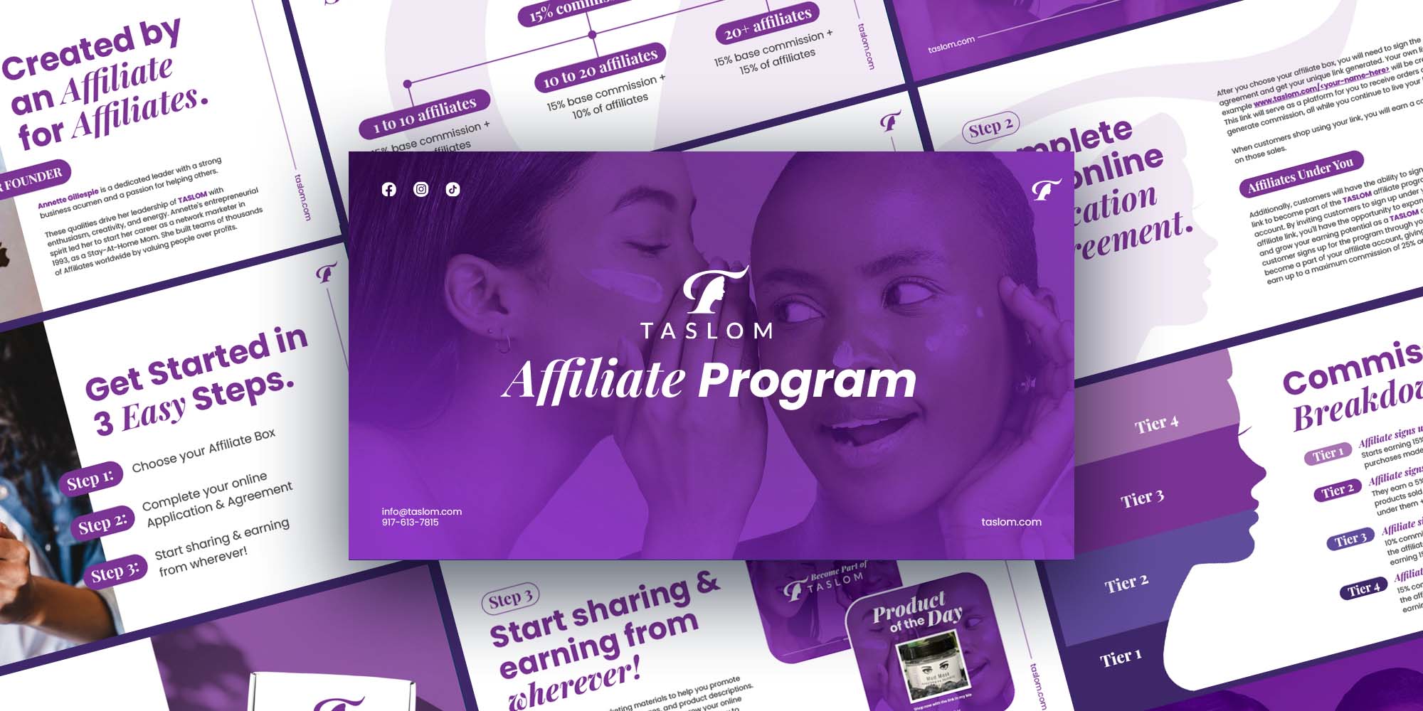
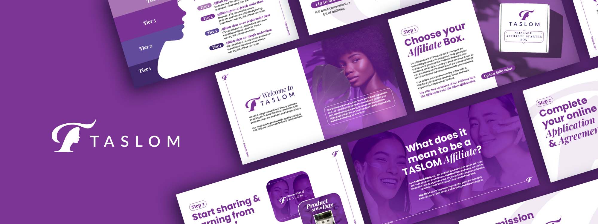
The choice of a monochromatic color scheme, with various shades of purple, sets a cohesive tone across the series of slides. Purple is often associated with creativity, luxury, and wisdom, which aligns with the brand's image as a provider of high-quality beauty and health products. The consistency in color not only strengthens brand recognition but also evokes the feeling of a premium, unified collection of products. Accents of white and lighter shades are used to create contrast, ensuring legibility and drawing attention to key areas like calls to action and headings.
The imagery used is diverse and inclusive, featuring individuals of different ethnicities, which reflects the brand's commitment to catering to a wide audience. These images are not merely decorative but serve to illustrate the real-life benefits and application of Taslom's products. By showcasing happy and confident individuals, the slides implicitly communicate the positive outcomes of joining the Taslom affiliate program, such as empowerment and community.
The slides' layout is dynamic yet balanced. Some slides use a grid
structure for orderly presentation of information, which is
particularly effective for conveying the affiliate program's
structure and benefits. Other slides feature an asymmetrical
layout with angled divisions and overlapping elements, which
injects energy into the design and encourages active engagement
from the viewer. The zig-zag composition in some slides cleverly
leads the eye through the content, facilitating a narrative flow
that feels both guided and organic.
Typography in the Taslom slides is not merely a vessel for
information but an active design element. There is a judicious use
of typefaces that harmonizes with the overall design. The type is
modern, clean, and readable, which is critical for maintaining
professionalism and clarity. The designers have also played with
spacing, alignment, and arrangement of text to enhance readability
and create visual interest.