Contact Details
sales@thrasker.com (813) 565-9024 10901 Danka Circle North, Suite BSt.Petersburg FL 33704
Introducing the logo design for Rack Design Build, a company
specializing in innovative and sustainable construction
solutions:
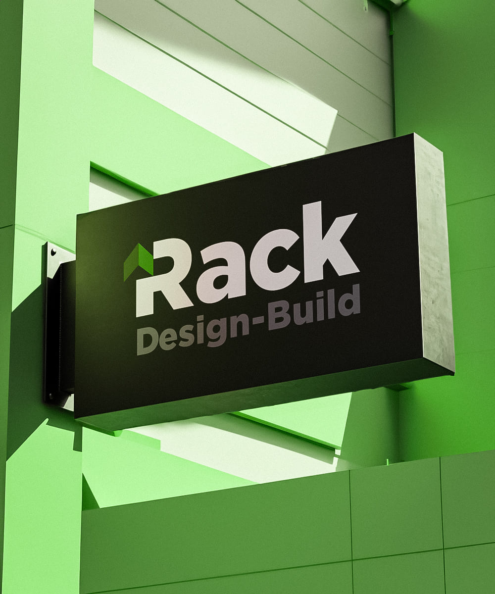
The Rack Design Build logo design is a modern and sophisticated
representation of the company's expertise in the construction
industry. It embraces a typography-based approach, combining
different colors and a small graphical element to create a
visually compelling and memorable brand identity.
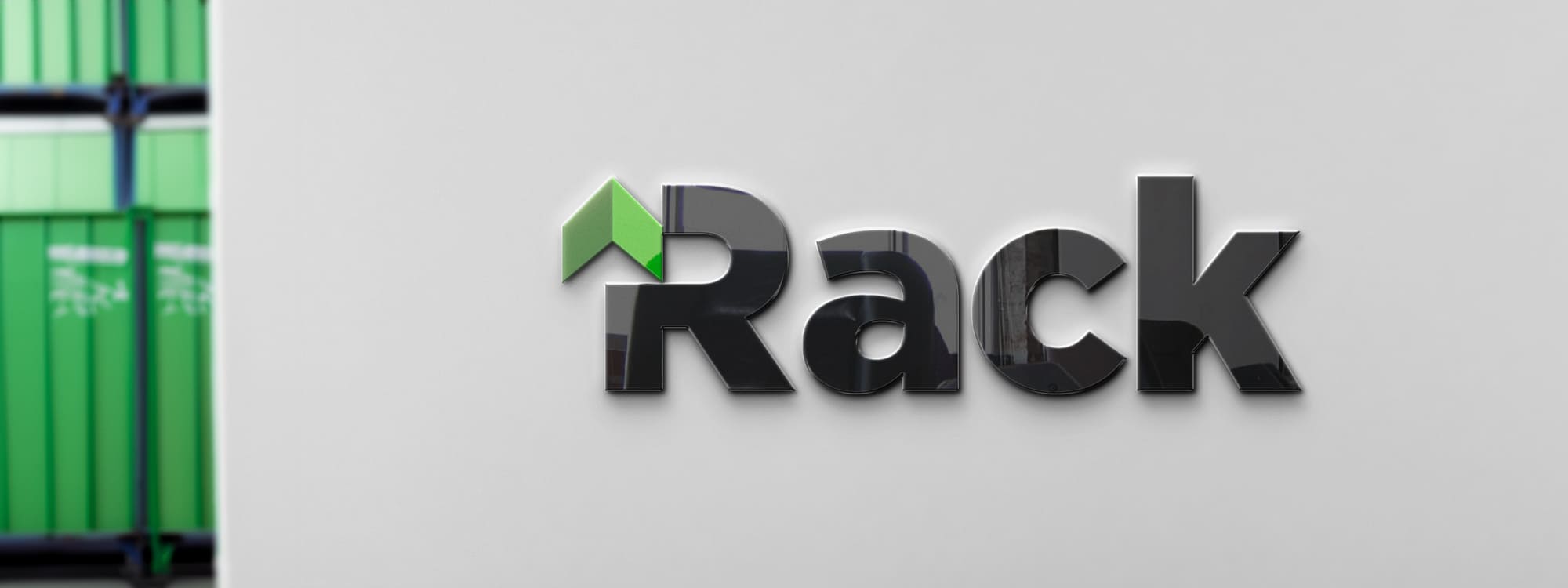
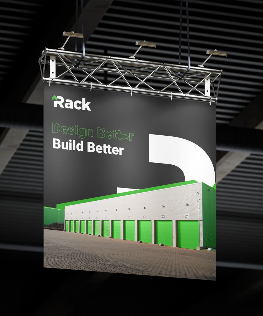
The word "Rack" takes center stage in the logo design, rendered in
a bold black font. The strong and confident typography reflects
the company's commitment to precision and excellence in their
construction projects. Black conveys a sense of professionalism,
reliability, and timelessness, aligning with Rack Design Build's
reputation for delivering high-quality results.
Adjacent to "Rack," the words "Design Build" are elegantly
presented in a complementary grey color. The subtle contrast
between black and grey creates visual interest and hierarchy
within the logo. The grey color signifies creativity, versatility,
and the company's comprehensive approach to providing design and
construction services. A small green arrow is incorporated as a
graphical element within the logo. The arrow symbolizes progress,
innovation, and sustainable practices. The vibrant green color
represents growth, sustainability, and the company's commitment to
environmentally conscious building solutions. The arrow pointing
upward signifies the company's forward-thinking mindset,
continuous improvement, and the ability to overcome challenges.