Contact Details
sales@thrasker.com (813) 565-9024 10901 Danka Circle North, Suite BSt.Petersburg FL 33704
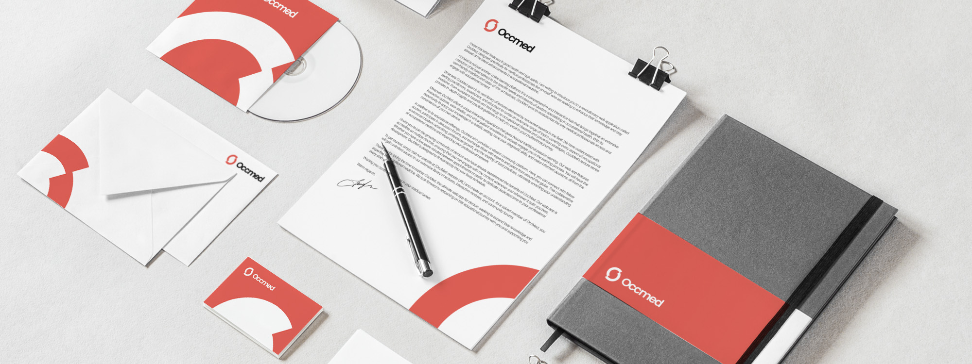
The logo for "Occmed" is designed to exude professionalism and make a strong visual impact. The font chosen is a bold, black, sans-serif typeface that conveys a sense of strength and authority.The centerpiece of the logo is the letter "O," which is positioned on the left side. The "O" is distinctive, as it is cut in two halves, creating a unique visual element. The logo is designed to make a memorable impression and effectively represents the brand identity of "Occmed."

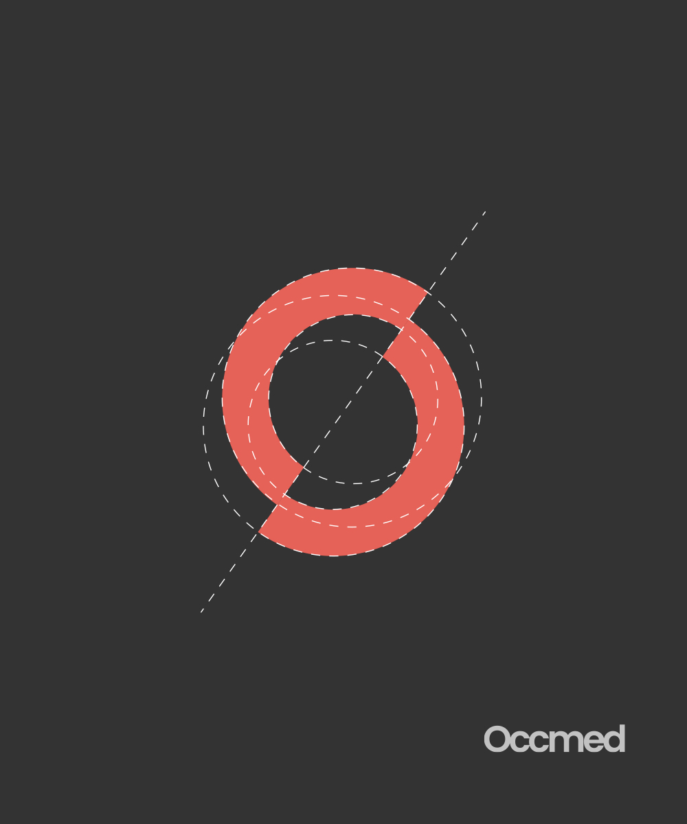
The red color used for the right half of the "O" is chosen deliberately to symbolize energy, passion, and urgency. It creates a focal point and acts as a visual anchor for the logo. The black color of the font adds a touch of sophistication and timelessness, enhancing the overall professional appeal.The logo is designed to be versatile and easily recognizable across various applications. It can be scaled up or down without losing its impact, ensuring it remains visually appealing and legible on different mediums, such as business cards, signage, and digital platforms. In summary, the "Occmed" logo features a bold black sans-serif font that represents strength and professionalism.