
We build websites and systems that help your business get discovered, grow faster, and present a polished, professional image - without the tech headaches.


Visual identity, ads, & sales assets that stand out.

CRM, lead flows, and booking that drive action.

Conversion-driven sites & full ad campaigns.

Bots, custom GPTs, & smart workflows

Coaching, scorecards, and team ops systems.

Secure access, recovery, and IT protection.
from audits and traffic to automations and handoff, each phase is built for clarity, traction, and sustainable growth.
We audit, benchmark, and uncover high-leverage opportunities.
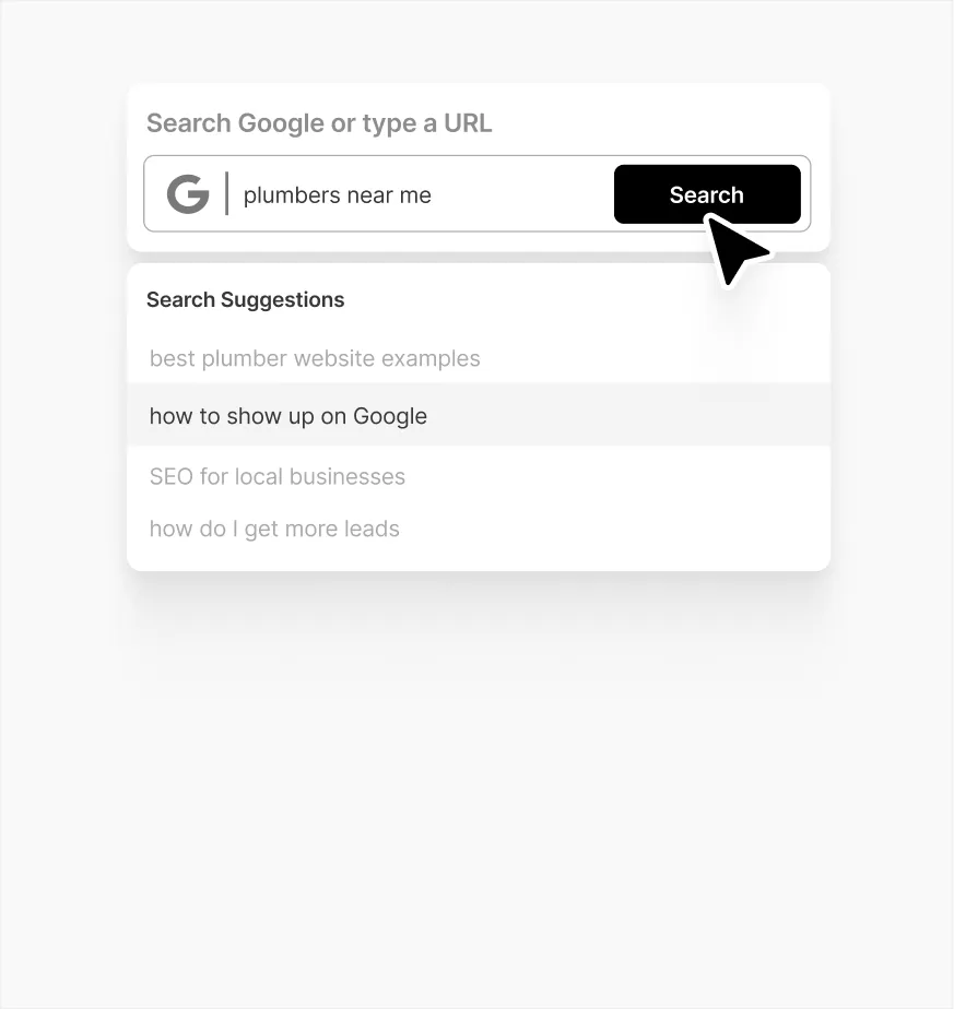
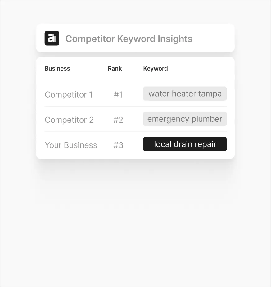
We drive qualified traffic through SEO, paid ads, and social.
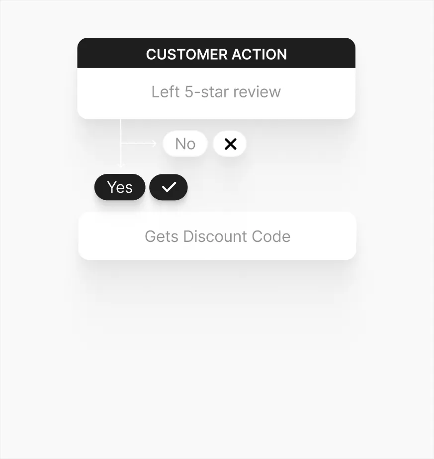
We automate nurturing, close deals, and optimize the sales flow.
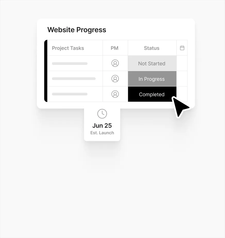
We streamline fulfillment to create a scalable client experience.
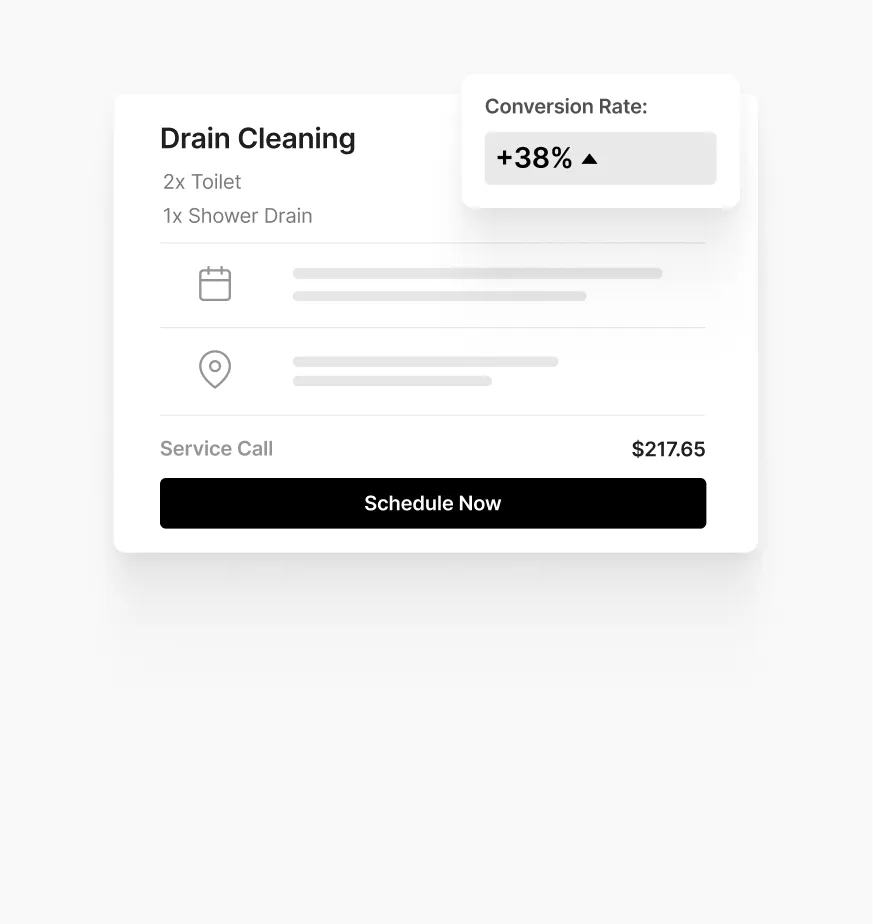
We turn traffic into leads with compelling offers and landing pages.
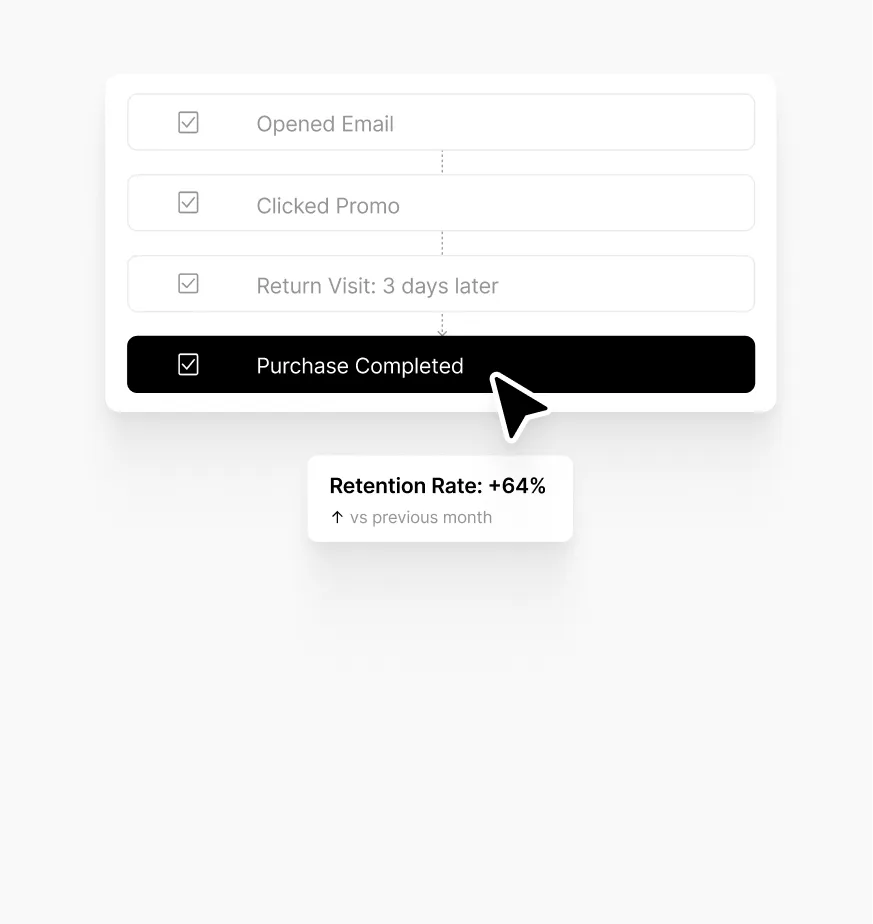
We keep customers engaged and refine everything with data.
+
In the agency industry field.
+
Worldwide in the last five years.
%
With a great experience and results.


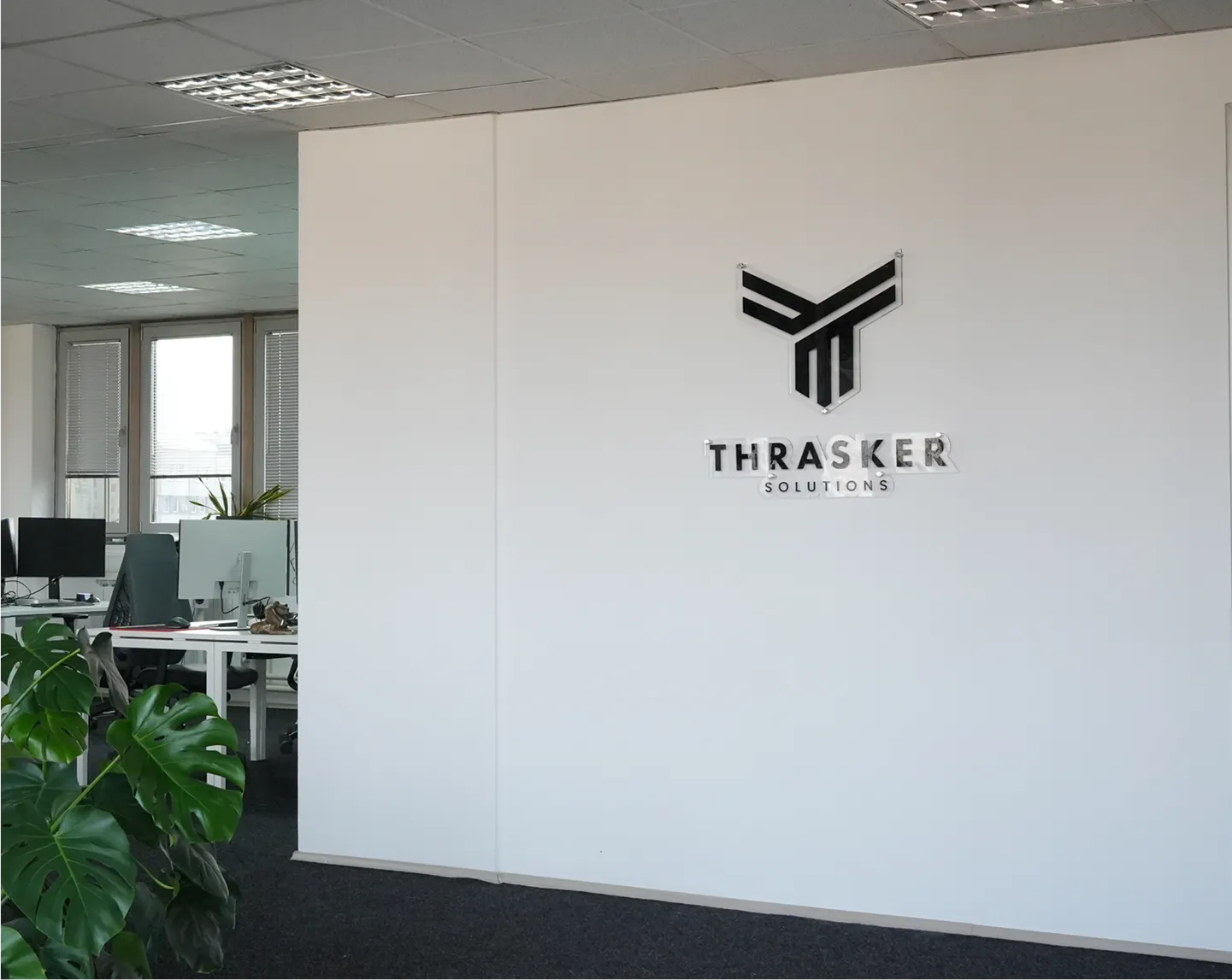
Thrasker blends strategy, creativity, and efficiency to deliver faster, smarter, and more scalable solutions - without the overhead. We go where others can’t.
Schedule a Free Call| In-House | Agencies | |||
|---|---|---|---|---|
| Speed | | | | |
| Flexibility | | | | |
| Quality | | | | |
| Scalability | | | | |
| Cost-effectiveness | | | | |

Scalable digital systems
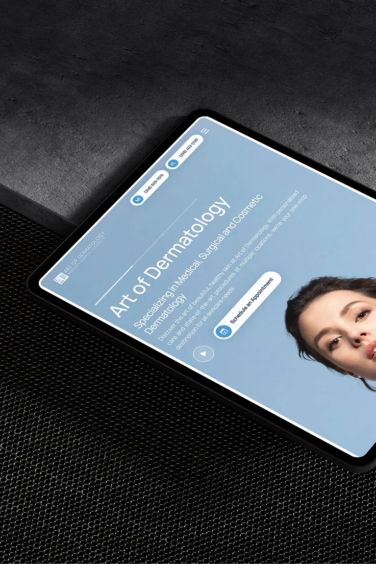
Full-funnel patient growth
Brand & lead enablement

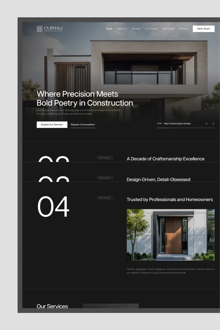
Form meets function
Ops-ready brand systems
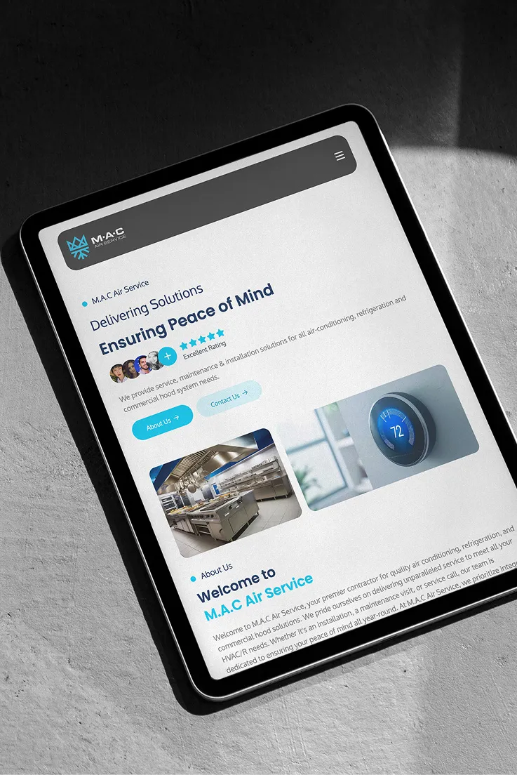
Local demand engines
Conversion-first platforms
Premium presence
Scalable digital systems
Full-funnel patient growth
Brand & lead enablement
Form meets function
Ops-ready brand systems
Local demand engines
Conversion-first platforms
Premium presence
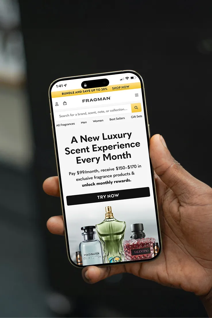
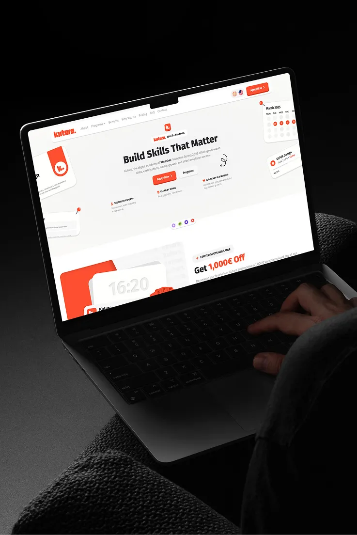
Every project is more than just pixels - it's a solution, a strategy, and a story. Here's a look at how we help brands grow with clarity, creativity, and measurable results.


Elegant, intuitive, and designed to convert. We now manage their social media to drive bookings and engagement.
Increase in bookings after improving the site and user journey.
New monthly visitors from faster load times, SEO, and ads.
Instagram engagement growth through curated visuals and consistent content.


Now managing email, Google Ads, and social to drive sales and loyalty.
Conversion lift after streamlining product flow and testing CTAs.
New monthly visitors from paid search and optimized landing pages.
Increase in returning customers through email and retargeting.


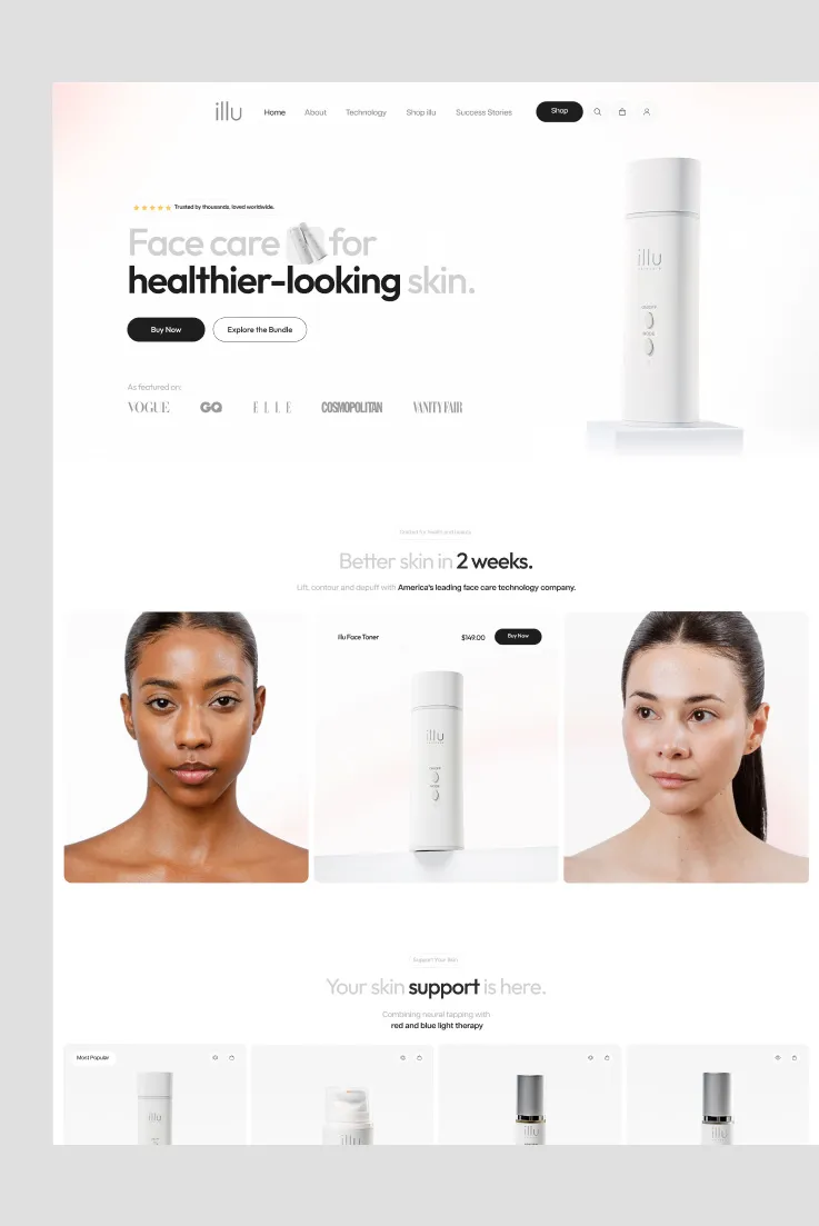
Designed to reflect their science-backed brand and boost conversions.
Increase in add-to-cart rate after refining product presentation.
New monthly visitors from faster site speed and SEO.
Lower bounce rate with streamlined, mobile-first design.
Here’s what they had to say:
%
called us “proactive”
%
said we exceeded expectations
%
voted fastest team
%
see us as true partners

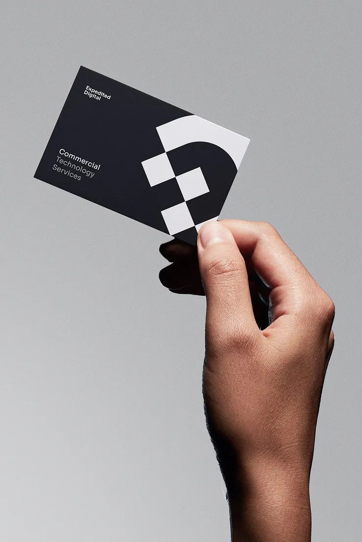
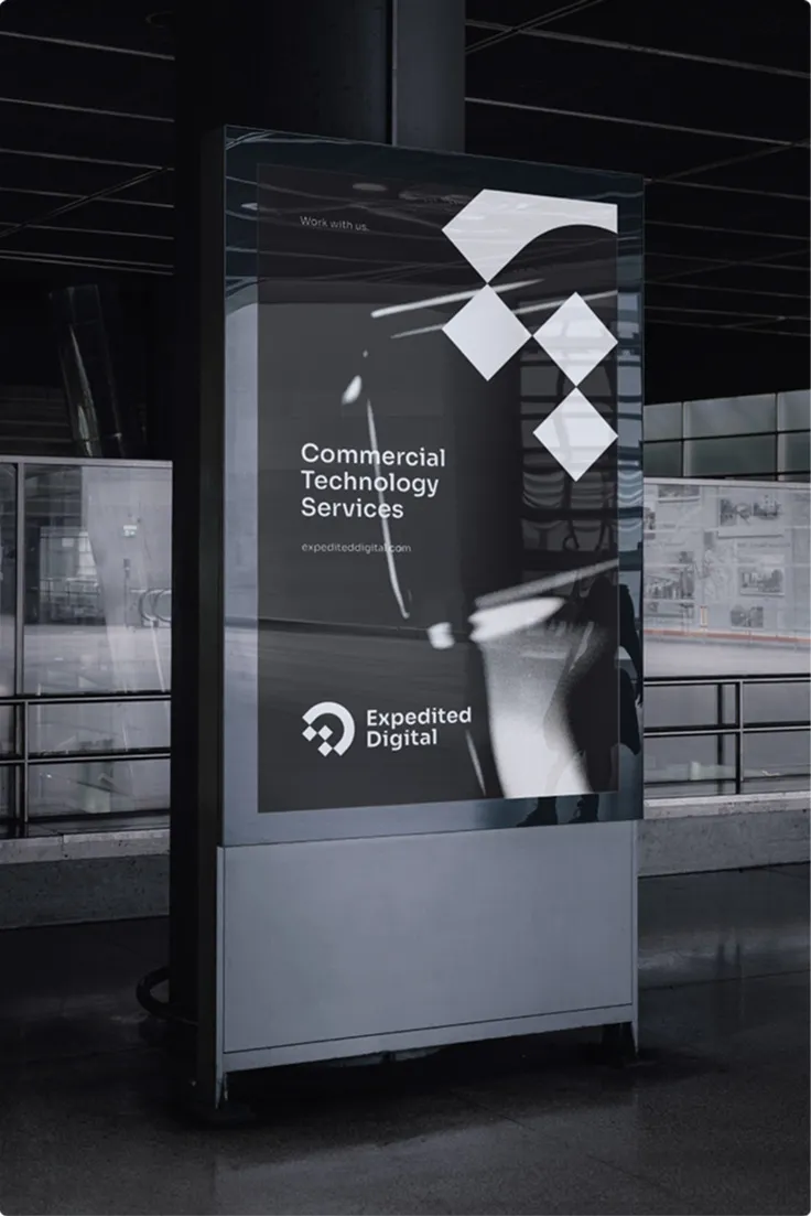
“Thrasker quickly helped us launch our site and brand with clear direction, timely updates, and great value. Highly recommend them for growth.”
Russell Anderson
Expedited Digital

“Thrasker consistently delivers top-notch design with remarkable attention to detail. Their team goes above and beyond to bring our vision to life.”
Aiden Anderson
Expedited Digital

“Thrasker got my brand, logo, and site launched fast. The team is super responsive, talented, and the perfect partner for scaling a business.”
Brad Clatt
C4 HR Solutions

“Thrasker made my website fast, painless, and exactly as I envisioned. Quick to respond and far exceeded other companies I’ve used.”
Cara Driscoll
Orange Dog Labor

“Michael and the Thrasker team are professional, prompt, and deliver exactly what’s needed. I strongly recommend them for world-class design.”
Jesus D. Bohorquez
Bohorquez Wedding
“Thrasker quickly helped us launch our site and brand with clear direction, timely updates, and great value. Highly recommend them for growth.”
Russell Anderson
Expedited Digital
“Thrasker consistently delivers top-notch design with remarkable attention to detail. Their team goes above and beyond to bring our vision to life.”
Aiden Anderson
Expedited Digital
“Thrasker got my brand, logo, and site launched fast. The team is super responsive, talented, and the perfect partner for scaling a business.”
Brad Clatt
C4 HR Solutions
“Thrasker made my website fast, painless, and exactly as I envisioned. Quick to respond and far exceeded other companies I’ve used.”
Cara Driscoll
Orange Dog Labor
“Michael and the Thrasker team are professional, prompt, and deliver exactly what’s needed. I strongly recommend them for world-class design.”
Jesus D. Bohorquez
Bohorquez Wedding

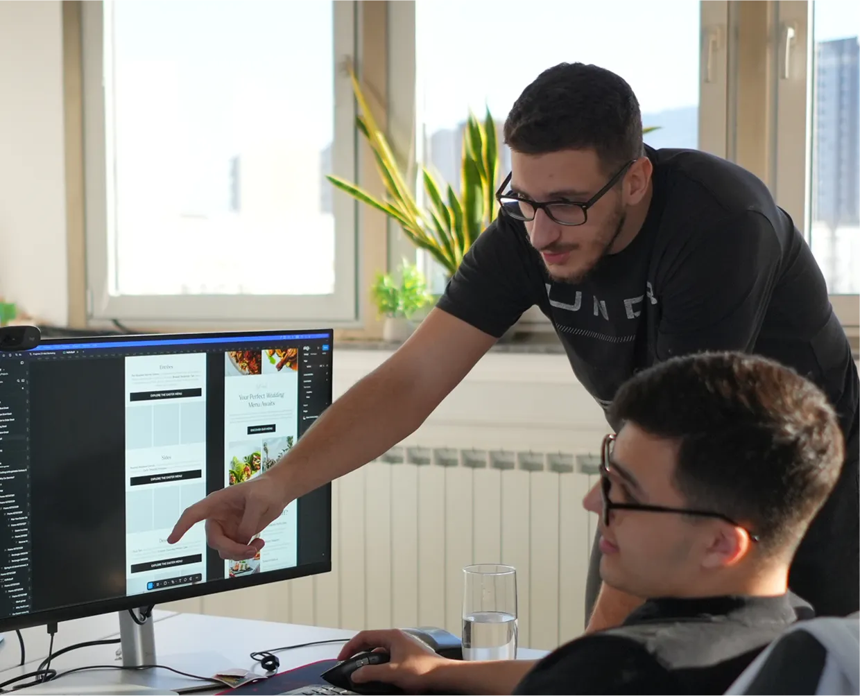
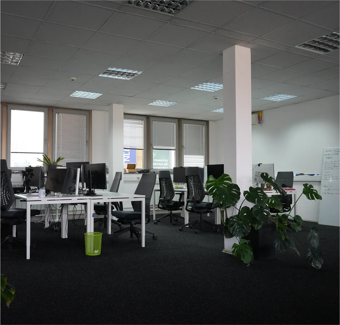
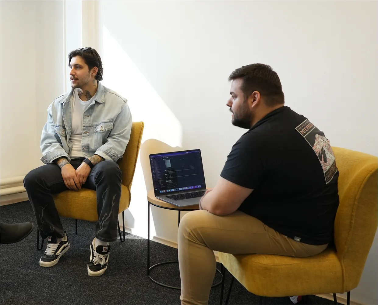
Smart operators. Strategic thinkers. The people who make growth happen. Together with you, for you.


Entry-level system install to get your foundational tech, CRM, and marketing setup live.
Solo founders or early businesses under $20K/month who need to look pro and launch fast.
Growth-tier package that expands into paid ads, automations, and lead tracking.
Growing businesses ($20K–$75K/month) looking to convert more leads and build out a predictable pipeline.
Most Popular
Multi-system execution across CRM, automation, creative, and performance management.
Scaling teams ($75K–$200K/month) needing support across marketing, tech, and sales accountability.
Full-scale outsourced CMO/CTO setup - strategy, execution, coaching, and reporting.
Multi-channel businesses ($200K+/mo) ready to unify vendors, eliminate internal bloat, and scale fast.
Dedicated team, deep integration, advanced systems, AI, and multi-location support.
Enterprises, franchises, or funded businesses that require a full-stack strategic partner embedded into operations.
Ready to install a complete growth engine for your business? Schedule a consultation - we’ll show you exactly how we can help you scale!
Sales Inquiries
Support Inquiries