Contact Details
sales@thrasker.com (813) 565-9024 10901 Danka Circle North, Suite BSt.Petersburg FL 33704
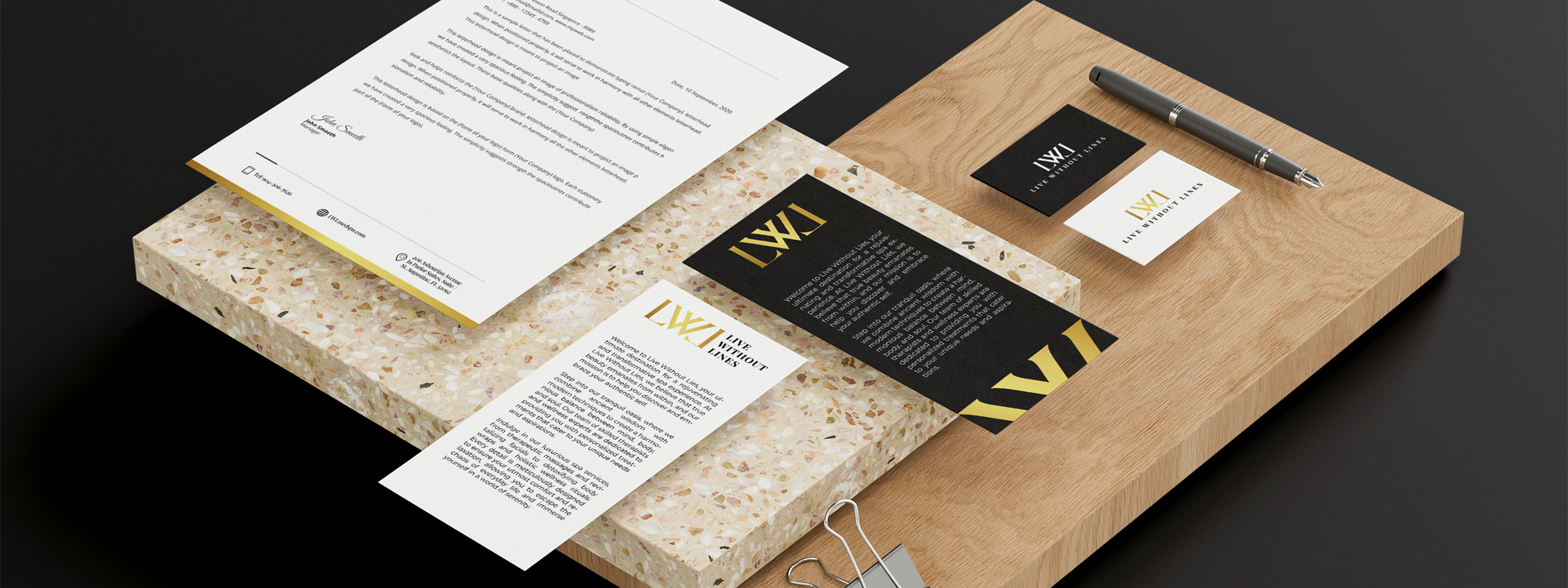
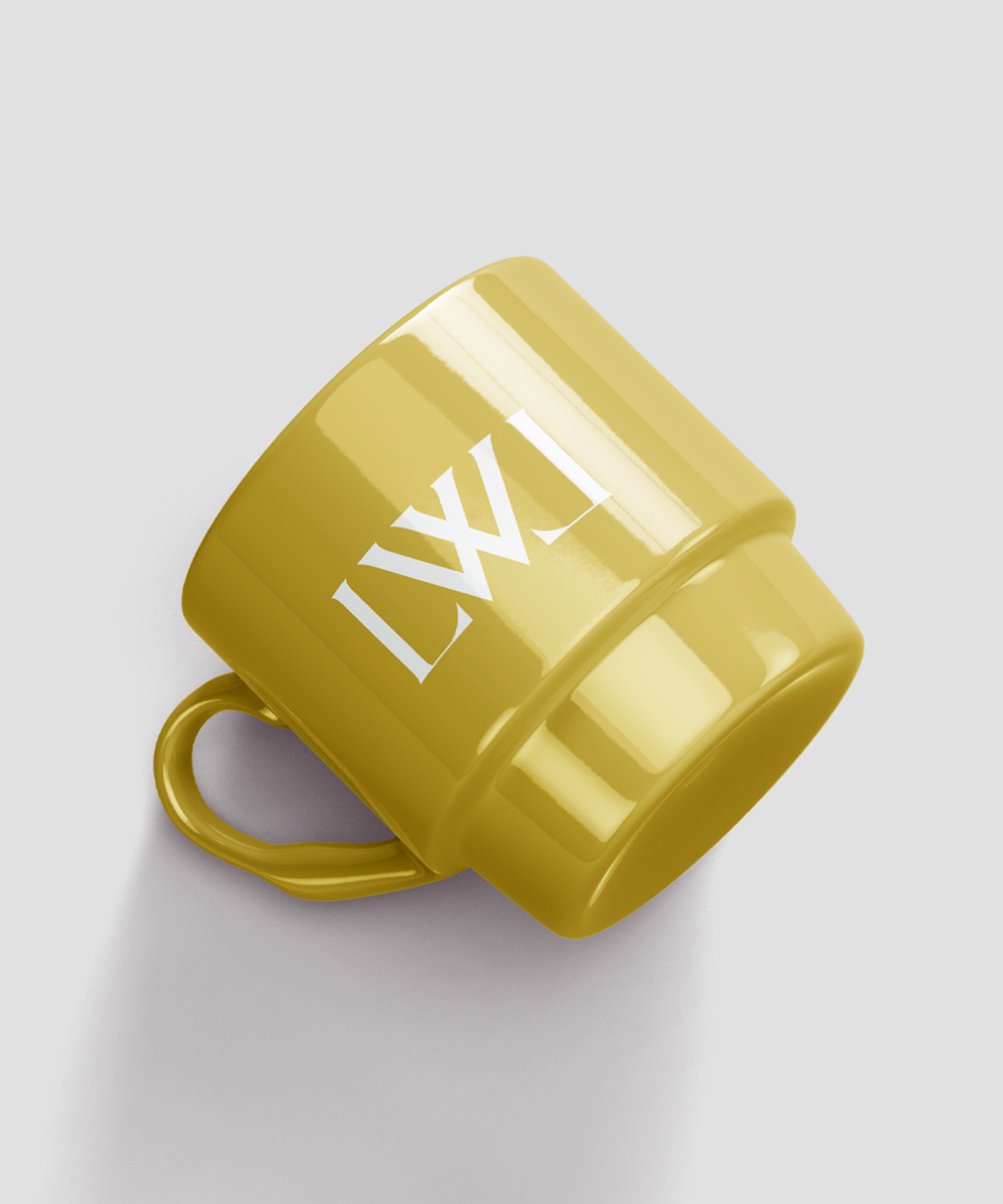
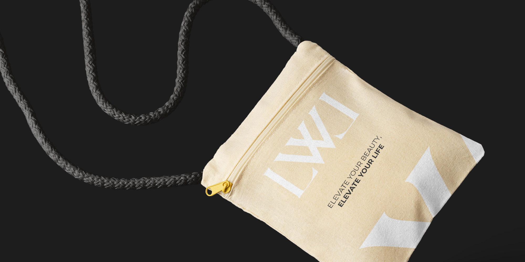
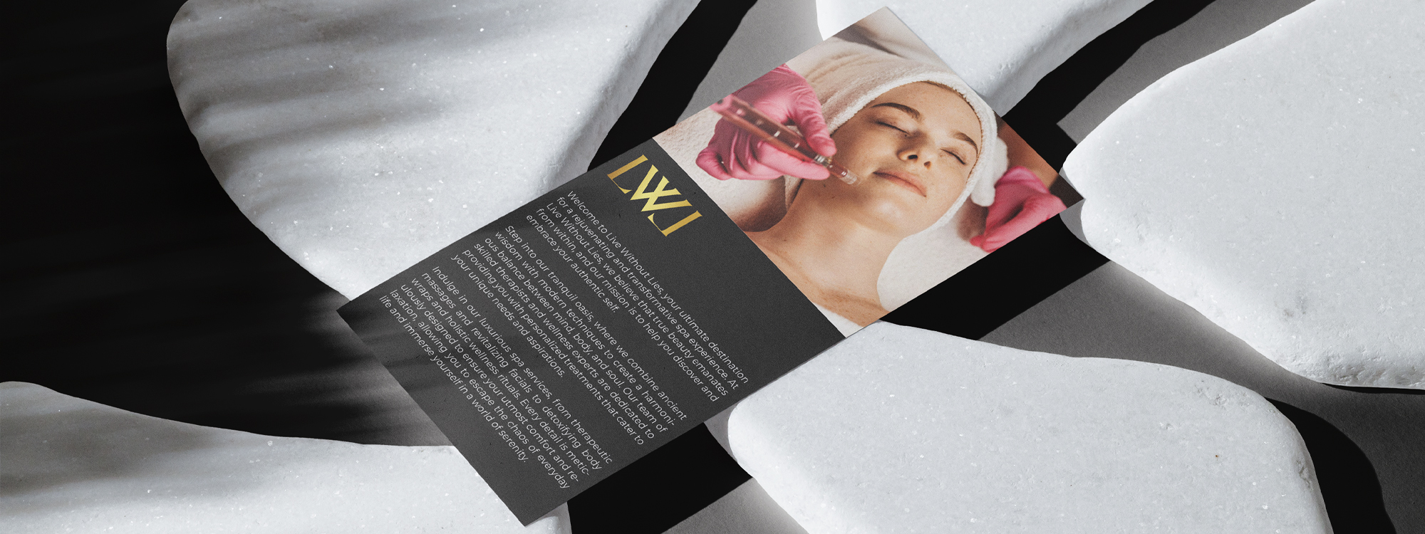
The "Live Without Lines" logo is designed to convey a sense of sophistication and elegance. The typography chosen for the logo is a black serif font, adding a touch of timeless beauty and professionalism to the design. At the top of the logo, a logo mark is positioned, featuring the letters "LW" and "L" flipped to create a symmetrical and visually pleasing composition. The letters are rendered in a gold gradient, adding a luxurious and glamorous element to the logo. The gradient effect enhances depth and dimension, creating an eye-catching and memorable visual. The color palette of black and gold is chosen to evoke a sense of elegance and refinement. Black symbolizes authority and timelessness, while gold represents luxury and exclusivity. The combination of these colors creates a sophisticated and visually striking contrast that captivates attention.

The process of designing the "Live Without Lines" logo began with an in-depth understanding of the brand's identity, target audience, and desired message. Extensive research was conducted to gather inspiration and insights into the industry and competition. Various design concepts were explored, focusing on the use of a black serif font to convey a sense of elegance, sophistication, and timelessness. Multiple font options were considered and carefully evaluated for legibility, visual appeal, and alignment with the brand's identity. For the logo mark, the idea of flipping the letters "LW" and "L" was developed to create a visually intriguing and unique arrangement. This concept aimed to capture attention and create a memorable visual identity for the brand. The design team experimented with different orientations and alignments to achieve a balanced and harmonious composition