Contact Details
sales@thrasker.com (813) 565-9024 10901 Danka Circle North, Suite BSt.Petersburg FL 33704
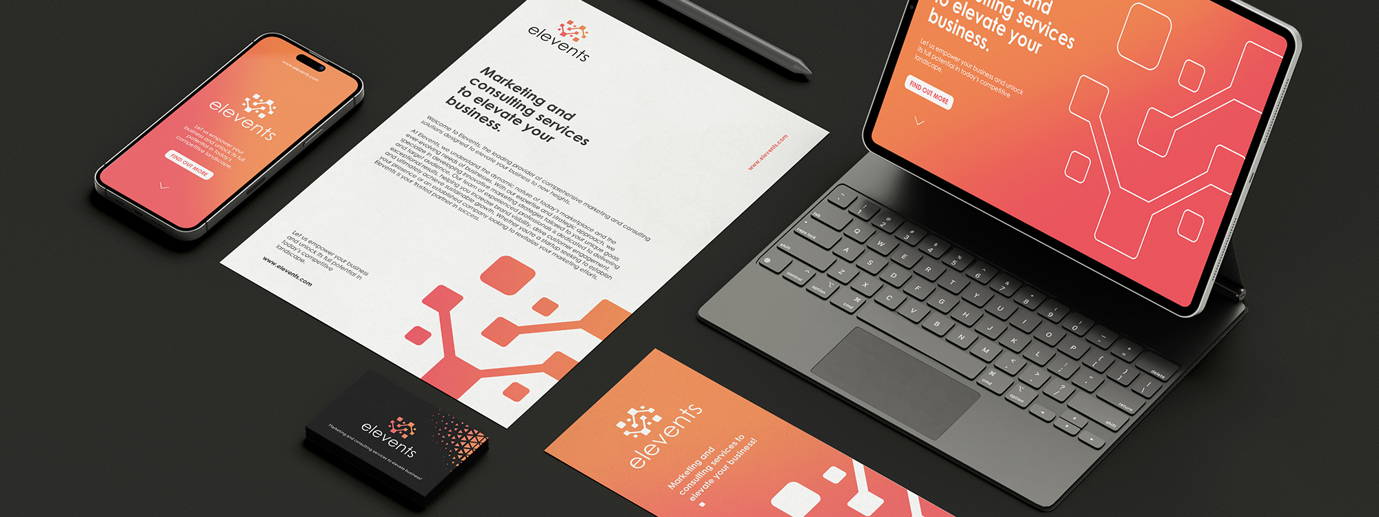
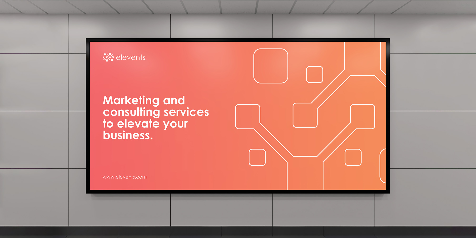
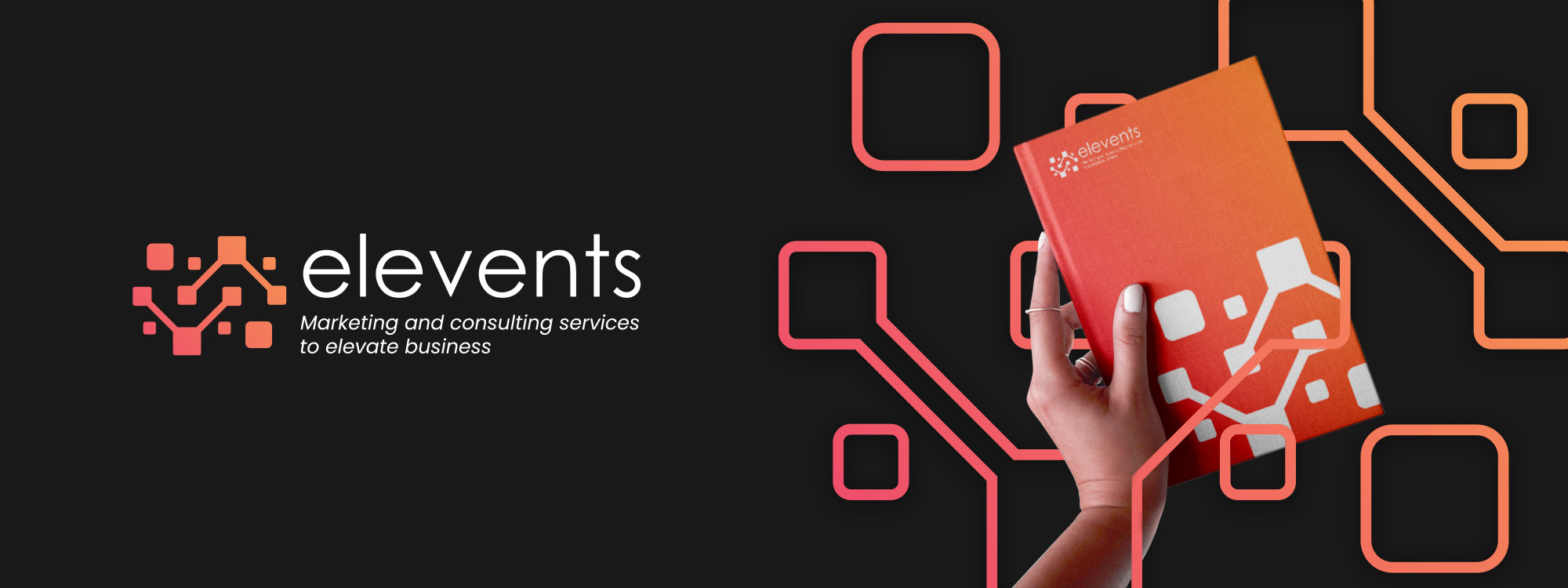
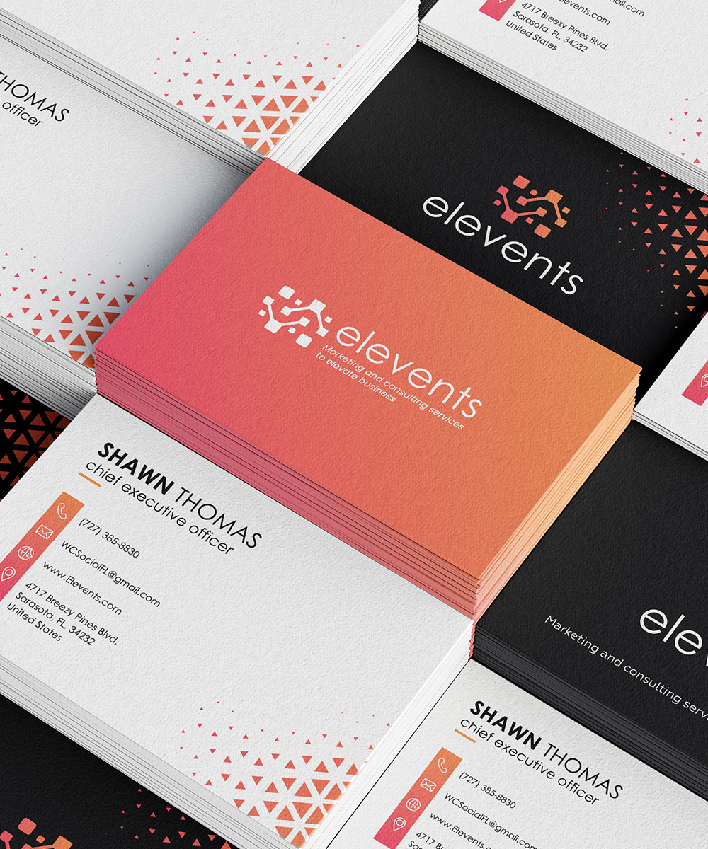
The "Elevents" logo is designed to be modern and visually striking, capturing the brand's essence. The typography chosen for the logo is a lowercase black font, adding a contemporary touch and creating a sense of approachability and friendliness. At the top of the logo, a logo mark is positioned, featuring a series of orange gradient cubes that are interconnected. The cubes symbolize the concept of events coming together and the interconnected nature of the brand's services. The use of an orange gradient adds depth and visual interest to the logo, while also conveying energy, creativity, and vibrancy. The logo mark is carefully crafted to create a visually pleasing and balanced composition.
The process of designing the "Elevents" logo began with a thorough understanding of the brand's identity and target audience. Extensive research was conducted to gather insights into the event planning industry and identify key visual elements that would represent the brand effectively. Multiple design concepts were explored, focusing on lowercase typography to create a modern and approachable look. The font selection involved careful consideration of legibility and visual balance to ensure the logo's readability across various applications. For the logo mark, the idea of interconnected cubes was developed to symbolize the coming together of events and the seamless coordination provided by Elevents. Through the use of an orange gradient, depth and visual interest were added to the cubes, evoking a sense of energy and creativity that aligns with the brand's values.