Contact Details
sales@thrasker.com (813) 565-9024 10901 Danka Circle North, Suite BSt.Petersburg FL 33704

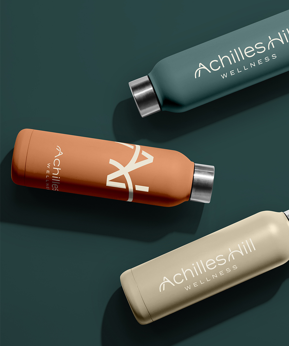
The "Achilles Hill" logo for the wellness company is designed to convey a sense of balance, growth, and holistic well-being. The logo focuses solely on typography, utilizing a dark green color to evoke feelings of harmony, nature, and rejuvenation.
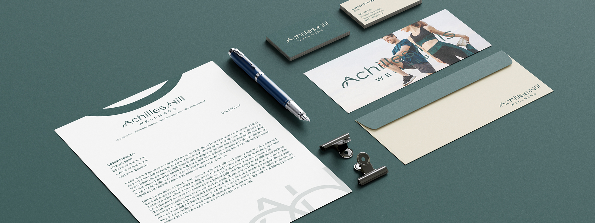
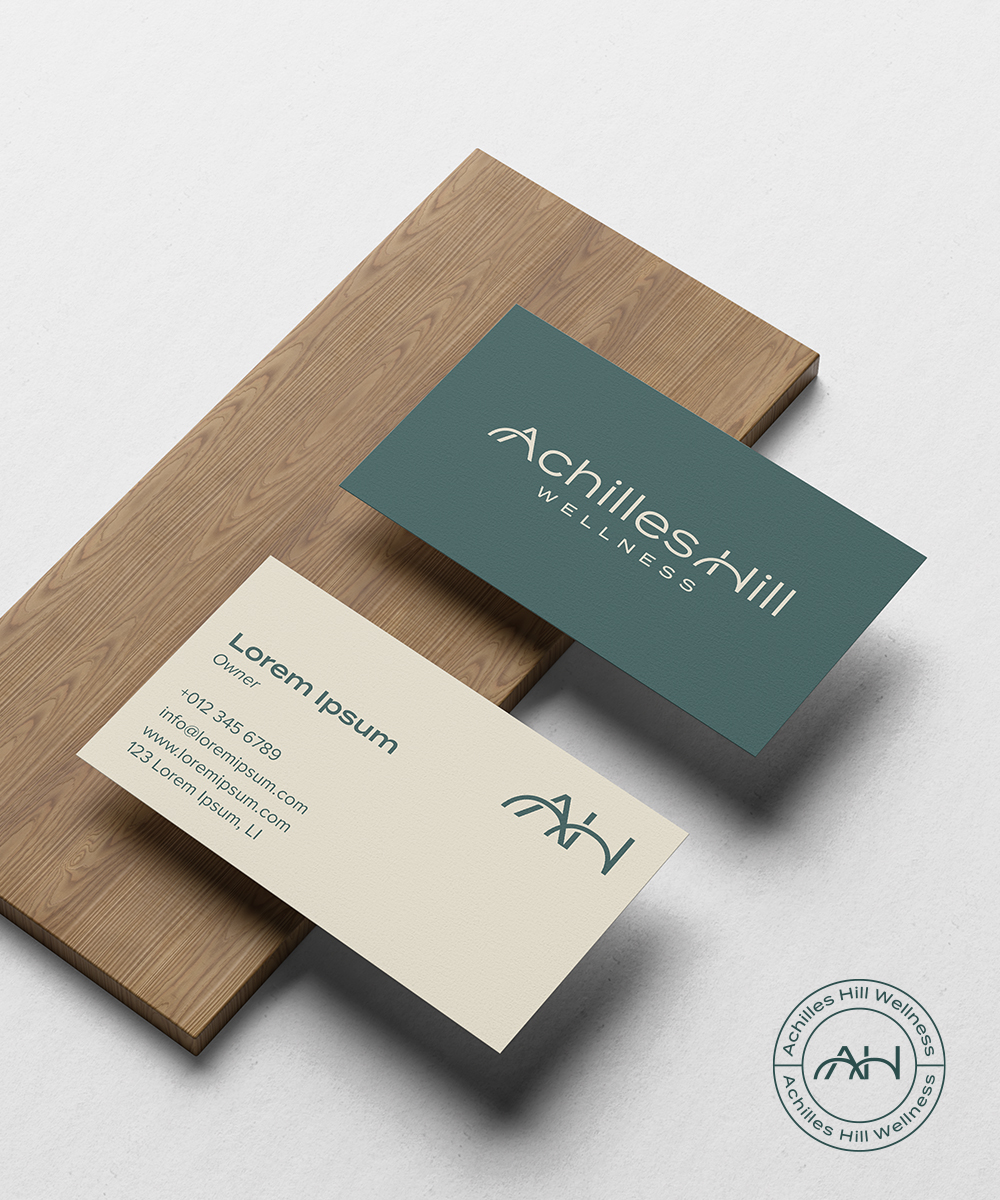
The chosen font for the logo is a clean and modern sans-serif typeface, reflecting the company's contemporary and professional approach to wellness. The letters 'A' and 'H' in the wordmark feature a unique design element—the middle line that extends outward. This design element symbolizes growth, progress, and the journey towards improved well-beingThe middle line extending from the 'A' and 'H' should be visually distinctive, either through its thickness or a gentle curve, to emphasize its symbolic representation. The line seamlessly integrates with the letters, flowing naturally without compromising legibility or the overall balance of the logo. The dark green color chosen for the logo represents vitality, nature, and rejuvenation. It is associated with the healing and calming properties of the natural world, reflecting the wellness company's focus on holistic health.